
Login

Skyview  >  Login

How to Choose Artistic Decorative Tiles in 2026?

Artistic Decorative Tiles can change the mood of a room before furniture or lighting does. In 2026, choosing them means balancing visual impact with daily use, installation needs, and long-term care. William Morris, the British designer and leading figure in the Arts and Crafts movement, offered a useful principle: “Have nothing in your houses that you do not know to be useful, or believe to be beautiful.” His words were not about modern tiles, but they remain a thoughtful test for a bold pattern or vivid glaze.

Start with the room. A glazed feature tile may brighten a kitchen backsplash, while a textured surface can feel uncomfortable underfoot or collect grime in a busy shower. Check the tile’s intended use, water exposure, slip performance, cleaning guidance, and installation requirements. Ask the supplier for technical specifications, not only a polished product photograph. Colors can shift under warm bulbs; grout can change a pattern’s appearance. Small details matter.

Then consider scale, color, and rhythm. Hold samples against the actual wall or floor, and view them in morning and evening light. A hand-finished edge may add character. It may also create slight variation, which is not everyone’s idea of perfection. Be honest about maintenance, budget, and the installer’s experience before committing. One sample is rarely enough. This guide explores how to compare styles, materials, finishes, and practical performance, so your choice feels considered—not merely attractive in a showroom.
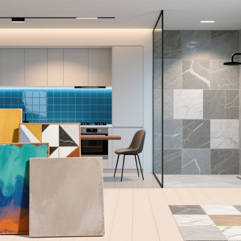
How to Choose Artistic Decorative Tiles in 2026?

Define the Tile’s Artistic Role, Palette, Pattern, and Room Scale

Decorative tile works best when its role is clear before you compare samples. A patterned backsplash can become the room’s focal point, while a narrow border may simply guide the eye. Choose one main job: attract attention, add texture, or connect nearby finishes. That decision keeps a striking tile from competing with every cabinet and light fixture. Small choice, big effect.

Build a palette from fixed elements such as flooring, counters, and painted walls. Hold samples beside them in morning and evening light; colors can shift noticeably. A warm white may look gray beside cool stone. Repeat one existing color in the tile, then use a contrasting shade sparingly. Do not trust a phone screen.

Pattern and scale need equal care. Large motifs often read clearly on open walls but can feel crowded around shelves, outlets, and windows. Tiny repeats suit compact areas, though too much repetition may look busy from across the room. Tape a sample-sized grid onto the wall before ordering, and include grout width. A beautiful sample can still disappoint when its pattern gets cut at a corner. Live with the mock-up for a day; even then, the finished layout may feel busier than expected.

How to Choose Artistic Decorative Tiles in 2026

Compare example square tile formats by face area. Smaller formats can make intricate patterns easier to compose; larger formats create broader visual fields. Consider the room scale, artistic role, palette, and pattern when choosing.

Face areas are calculated from the stated example dimensions; actual tile sizes and available formats vary.

Compare Materials: ANSI A137.1 Defines Porcelain as ≤0.5% Water Absorption

How to Choose Artistic Decorative Tiles in 2026?

When comparing artistic decorative tiles, consider what the material can handle, not only its pattern. ANSI A137.1 defines porcelain tile as having water absorption of 0.5% or less, measured using standardized testing. This low rate can make porcelain practical for wet rooms, backsplashes, and floors that need frequent cleaning. Still, absorption alone does not prove a tile is slip-resistant, stain-proof, or suitable for every installation. Check the technical data and intended-use guidance. A glossy surface may feel slick when wet.

Tips: Ask for the absorption result and test method in writing. Inspect several pieces under your room’s lighting, including their edges, glaze, and texture. For shower floors, confirm that the tile size and finish suit the slope and grout layout. Tiny mosaics can provide more grout joints, but they also need careful cleaning. Don’t guess.

Artistic details can hide practical differences. A hand-shaped edge may create uneven grout lines, while a printed design may repeat visibly across a wall. Compare multiple samples, and ask an installer about cutting, sealing, and maintenance before ordering. I would not choose by absorption number alone. It matters, but it is only one part of the decision; some beautiful finishes are less forgiving than they look.

How to Choose Artistic Decorative Tiles in 2026? — Compare Materials: ANSI A137.1 Defines Porcelain as ≤0.5% Water Absorption

Tile material or category Water absorption and classification Decorative design possibilities Practical considerations Often considered for
Porcelain tile ANSI A137.1 defines porcelain tile as having water absorption of 0.5% or less. Available in printed patterns, mosaics, varied colors, and textured or relief designs. Check the specific tile’s wear, slip, and installation information; surface finish affects cleaning and traction. Floors, walls, and areas where low absorption is a selection priority.
Other ceramic tile Absorption depends on the tile body. ANSI ceramic classifications include impervious (>0.5% to 3%), vitreous (>3% to 7%), semi-vitreous (>7% to 18%), and non-vitreous (>18%). Glazes and decorative finishes offer a wide range of colors, motifs, and surface effects. Confirm the tested absorption category and intended application. Some tiles are intended for walls rather than floors. Feature walls, backsplashes, and other applications specified for the selected tile.
Glass tile Glass is not classified using the ceramic-tile absorption categories; check the product’s technical data and installation requirements. Can add translucency, reflective color, and small-scale mosaic patterns. Installation methods vary by glass type. Follow the manufacturer’s guidance for setting materials, cutting, and use. Decorative accents, backsplashes, and feature areas where the specified product is suitable.
Natural stone tile Absorption varies by stone type and individual material; ceramic-tile categories do not apply. Consult the stone’s technical data. Natural variation in color, veining, and texture gives each installation a distinct appearance. Some stones may require sealing and stone-specific cleaners. Confirm care requirements before selecting. Decorative floors, walls, and accents when the stone’s properties suit the location.
Decorative finish or relief A finish is not a material category; absorption is determined by the tile body and its test results. Hand-painted looks, patterned surfaces, metallic details, and raised textures can create visual emphasis. Deep relief and textured surfaces can take more effort to clean. For floors, verify the product’s suitability and slip information. Feature walls, niche backs, and carefully selected accent areas.

Selection note: Water absorption is only one comparison point. Verify the individual tile’s technical data, intended use, finish, slip-related information, and care instructions before purchase.

Match Surface Grip to Use: ANSI A326.3 Sets DCOF ≥0.42 for Level Interior Wet Areas

How to Choose Artistic Decorative Tiles in 2026?

A striking pattern can transform a hallway, shower, or kitchen. But wet feet change the decision. ANSI A326.3 sets a DCOF benchmark of at least 0.42 for level interior areas expected to be walked on when wet. The test measures dynamic friction under specified conditions; it does not promise that every tile will prevent slips. The Tile Council of North America Handbook also advises considering where and how flooring will be used. A glossy motif near a sink may look elegant, yet soap residue and water can make the surface less forgiving. I would compare the test result with the actual room, not just the sample board.

Tips: Ask for the tile’s ANSI A326.3 test information. Check the finish with wet hands, if permitted. Small mosaics create more grout lines, which may affect underfoot feel and cleaning.

For a busy bathroom, look for a surface intended for interior wet use and verify its DCOF documentation. Also consider slope, drainage, footwear, and cleaning products. The 0.42 value applies to level interiors, not every shower floor or outdoor step. That distinction is easy to miss. When possible, inspect a larger sample under realistic lighting; decorative colors and texture can look different once water beads across the surface. A careful choice may sacrifice a little shine. That trade-off is worth thinking through.

Plan Tile Size, Layout, Grout Width, and Feature-Panel Placement

Choose tile size after measuring the room, not from a showroom sample. Large-format tiles can reduce grout lines, but narrow walls and niches may create awkward slivers. Houzz’s 2024 U.S. Bathroom Trends Study reports that 84% of renovating homeowners chose tile for shower walls, a reminder that this surface often sets the room’s visual tone. Sketch the layout at scale, mark plumbing and corners, then test where full tiles land. A paper plan helps; a dry layout on the floor catches surprises.

Grout width affects both appearance and installation. The Tile Council of North America’s Handbook recommends joints at least three times the tile’s actual facial variation, with a 1/16-inch minimum. Follow the tile maker’s instructions and confirm the installer’s plan, especially for handmade or irregular-edged pieces. Measure twice. A feature panel usually works best where the eye naturally pauses, such as behind a vanity or inside a shower niche. Align its edges with nearby fixtures or tile joints; otherwise, a striking pattern can feel accidentally off-center.

Tips: Tape a full-size panel outline on the wall before ordering. Check it from the doorway and from seated eye level. Use a contrasting grout sample beside the actual tile, since lighting can shift its color. I’ve seen careful plans miss one detail: a cut tile hidden behind a door may still catch the eye when the door opens. Walk the room from several angles before finalizing the layout.

Verify Samples, Installation Requirements, and Maintenance Before Ordering

How to Choose Artistic Decorative Tiles in 2026?

A tile sample can look brighter online than it does beside your kitchen window. Request several pieces, not just one, and view them in morning and evening light. Check it in daylight. Compare the surface, edges, and color variation across the whole group. A hand-painted pattern may shift slightly from tile to tile; decide whether that variation feels lively or distracting. Place samples beside your actual grout options and nearby finishes. If possible, wet one sample to see how its color and texture change. I may be overcautious, but a small board on the wall can reveal more than a polished product photo.

Before ordering, confirm how the tile must be installed. Ask about suitable wall or floor surfaces, weight limits, cutting methods, grout joints, and compatible setting materials. Detailed patterns may need careful layout so the design does not end abruptly at a doorway or cabinet edge. Share the measurements and a simple layout with your installer before buying extra material. Then check maintenance requirements: porous surfaces may need sealing, while textured pieces can hold dirt in their grooves. Ask which cleaners are safe and whether routine resealing is expected. Keep a spare tile. One detail is easy to miss: decorative surfaces may show scratches or residue sooner than plain ones, so test cleaning on a sample first.